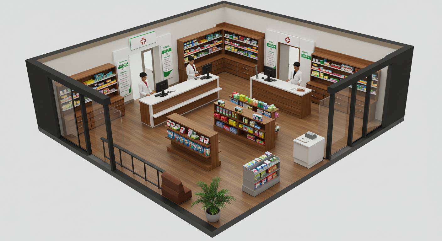
Have you ever wondered how your pharmacy’s arrangement affects how many clients buy? Your pharmacy’s floor plan is how you choose to design its layout. There is a reason why supermarkets place essential products in positions that force clients to walk through a vast part of the establishment. They keep products bought on impulse at the checkout. Think of your pharmacy’s floor plan as the view of its layout from a bird’s point of view. It is the picture someone gets if they view your pharmacy from above. Your pharmacy’s floor plan should use the space effectively to drive customer engagement.
Consider the requirements of the Pharmacy and Poisons Board (PPB) when mapping out your pharmacy’s floor plan. Use your pharmacy’s floor plan to build your brand. Leading companies like banks generally have a unified floor plan. Their consistency across branches builds into their brand. Build your pharmacy’s layout to increase efficiency, giving customers a memorable experience. Think through what you want your clients to experience when they walk into your pharmacy. Create a floor plan that aligns with your vision. A proper layout can help you push products through the process of merchandising. Where you place your items in your pharmacy can help promote the products.

Create a layout that provides a clear path through your pharmacy. Avoid floor plans that cause the customers to feel awkward, wondering who they should talk to first. Your pharmacy should feel organized with labels that help clients know where to head with minimal assistance. Disorganised pharmacies may be unattractive to customers, impacting your bottom line. Design your pharmacy’s layout in a way that slows down your clients so that they don’t exit before buying what they need. The floor plan should encourage them to consider the products you are offering. Create eye-catching visuals from your merchandise.
Arrange your products in a way that attracts the attention of clients. Make the most of the right turn. Studies show that many people turn to the right when they enter a store. Experiment with placing items you need to move on the right-hand side of your pharmacy. Make the wall on this side stand out by making its displays higher and broader than the rest of your pharmacy. Consider using colors that align with your brand theme. Online tools like Canva can automatically pull out the color codes from your logo to help you know the exact shades to use across your brand.

Use the threshold area of your pharmacy to display products you want to move quickly. The area is where your customers first step from outside into your store. Some call it the decompression zone. Many stores have it measure between five to fifteen feet, depending on the size of your pharmacy. Customers subconsciously judge your pharmacy, including how much they are willing to pay when in this area of your store. Such thoughts will translate into whether they consider your store cheap or expensive. The decisions impact your sales and can determine how much your stock expires on the shelf.

